Negative Space Liner: The Bare-Skin Graphic Eye
Negative space liner is a cat eye you leave unfinished on purpose. The bare strip of skin is the hardest part to control, so here is how the geometry works.
Most eyeliner techniques are about adding a line. Negative space liner is about the line you choose not to add. The design element is the bare skin, the gap you deliberately leave between two strokes of liner, and that gap is the part almost everyone gets wrong.
Here is the counterintuitive bit: the empty space is harder to control than the painted line. When you draw a solid wing, any wobble disappears into the rest of the line. When the strip of bare skin is the focal point, every uneven millimeter shows, because your eye reads the shape of the gap, not the strokes around it. The blank part is doing the work, so it has to be precise.
What the look actually is
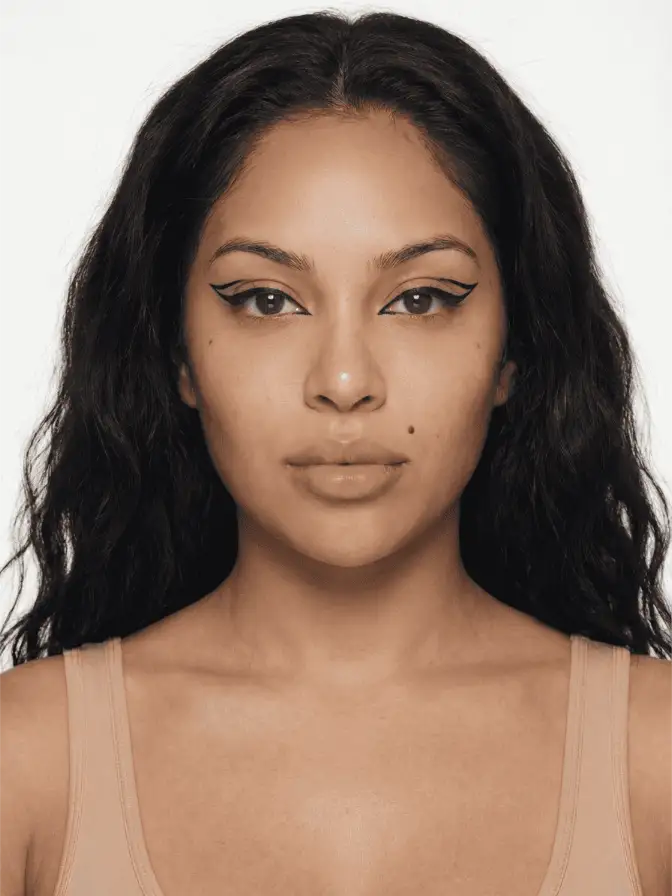
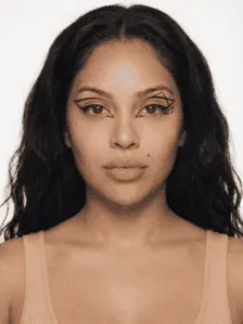
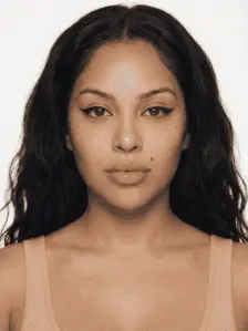
Strip it back and negative space liner is a cat eye you have not filled in. As the team at HQhair puts it, the look relies on the gap of bare skin to create a graphic alternative to classic liner. You can think of it as the double wing with the middle left open, or the classic cat eye cut into two parallel lines with a channel of skin running between them.
The simplest construction, the one IPSY breaks into three steps, is this. Line your upper lash line and pull a wing out from the outer corner the way you always would. Then draw a second line that sits above the crease, following the curve of the eye, so it mirrors the first. The untouched skin between those two lines is your negative space. Ogle School teaches a near-identical map, using the crease itself as the template for the upper line so the gap stays even with the eye’s natural shape.
That is the whole trick. Two lines, one gap, and a lot of attention paid to the gap.
Why product choice decides everything
This is the one place I will not flex. Use a gel or a liquid liner, never a kohl pencil. HQhair, Ogle School, and IPSY all land on the same point, and they are right: kohl is engineered to smudge, which is exactly what you want for a smoked-out graphic liner moment and exactly what you do not want here. The negative space look lives or dies on the crispness of two edges. A creamy pencil will creep into the bare strip within an hour and close the gap you worked to keep open.
A felt-tip liquid pen is the most beginner-friendly because it lays a thin line and dries roughly where you set it down. A gel liner with a fine synthetic brush gives you more control over thickness if you want the lines to taper. Whichever you reach for, the requirement is the same: it has to hold a sharp border against bare skin without bleeding.
Mapping before you commit
The mistake I see most often is drawing one line fully, loving it, then realizing the second line cannot mirror it without making the gap lopsided. Map both edges first with light, sketchy strokes, then commit.
A few principles that keep the geometry honest:
- Check the gap with your eyes open. A gap that looks even when you are staring down into a mirror often vanishes or balloons when you look straight ahead, because the lid folds differently. Open your eyes, face forward, and judge it then.
- Match the negative space to your eye shape. A wider gap reads bold and editorial on a larger lid; a thin sliver of bare skin suits a hooded or smaller eye, where a fat gap disappears into the fold the moment you blink.
- Decide where the lines meet, or whether they do. You can let the two lines join at the outer corner into a sharp point, or leave them open so the negative space runs right off the edge. Both work; just choose on purpose.
- Clean up, do not redraw. Stray product gets lifted with a flat brush and a little micellar water. Redrawing to “fix” a wobble almost always thickens the line and eats the gap.
Variations once you have the base down
The two-line version is the foundation, but the technique opens up fast once the gap is under control.
The most beginner-friendly variation barely deserves the name: draw a normal wing, then simply do not fill in the triangle at the outer corner. Bustle has pointed to this “unfilled wing” as the easiest on-ramp, and it is, because you are only managing one new edge instead of two. From there you can graduate to the full double-line construction.
Color is where it gets interesting. Because the bare skin already supplies contrast, a colored liner reads louder against it than the same color would inside a filled shape. A cobalt or emerald line with a strip of skin glowing beneath it has more punch than a fully colored lid, and uses a fraction of the product. NYX’s roundup of graphic looks leans on exactly this, using bright liner sparingly so the negative space carries the drama.
A second trick worth knowing is the white-or-skin-tone liner. If your gap keeps closing up because the lid creases, you can cheat it by running a pale liner or a touch of concealer through the bare strip to keep it crisp and defined, almost outlining the emptiness. It sounds fussy. It is the single most reliable fix for hooded eyes, where the natural fold wants to swallow the gap the moment you blink.
You can also flip the orientation entirely. Instead of two horizontal lines with a gap between them, some looks split the wing vertically or float a second line out toward the brow, closer in spirit to a graphic liner study than to a wearable daytime eye. The principle never changes: define the shape of the space, not just the shape of the line.
Where it earns its keep
Negative space liner photographs beautifully because the bare skin reflects light where a solid line would absorb it, so the eye looks more open in pictures than a heavy wing tends to. It also reads as deliberate in a way few quick looks do; the precision is the point, and people register it. If you have already worked through a standard negative space liner once and found the gap drifting by midday, the fix is almost always the product, not your hand. Switch to a liquid or gel, map both edges before you fill either, and let the empty space do the talking.
Frequently asked
What eyeliner is best for negative space liner?
A gel or liquid liner, not a kohl pencil. The whole look depends on a crisp edge, and kohl is built to smudge and blur. A felt-tip liquid pen is the most forgiving for beginners because it lays down a thin, controllable line and dries where you put it.
Is negative space eyeliner hard for beginners?
It is easier than a full cut crease and harder than a basic wing. The skill is not drawing the lines; it is keeping the gap between them clean and even. If you can draw a steady wing, you can do the simplest version, which is just a wing you do not fill in.
How do I keep the bare gap clean?
Map both edges before you commit to either, then check the gap with your eyes open and looking straight ahead, not down at the mirror. Clean up stray product with a flat brush dipped in micellar water rather than redrawing, which only widens the line.
Continue reading
- technique Stained Blush Without the Blotch: Applying Watercolor Cheek Tints Liquid and water-gel blush goes patchy because of speed and prep, not the formula. Here is the small-area, damp-finger method that fixes the blotch for good.
- technique Puppy eyeliner: the downturned wing for rounder eyes Puppy liner drops the flick instead of lifting it, the opposite of a cat eye. Why the downturned wing flatters hooded and downturned eyes, and how to draw it.
- technique Eyeshadow by Eye Color: The Complementary Rule, Used Well The color wheel says wear the opposite of your eye color. That is true and incomplete. Here is why complementary shadow works, and the nuance for each eye.