Blush draping by face shape: the C-curve rule that actually works
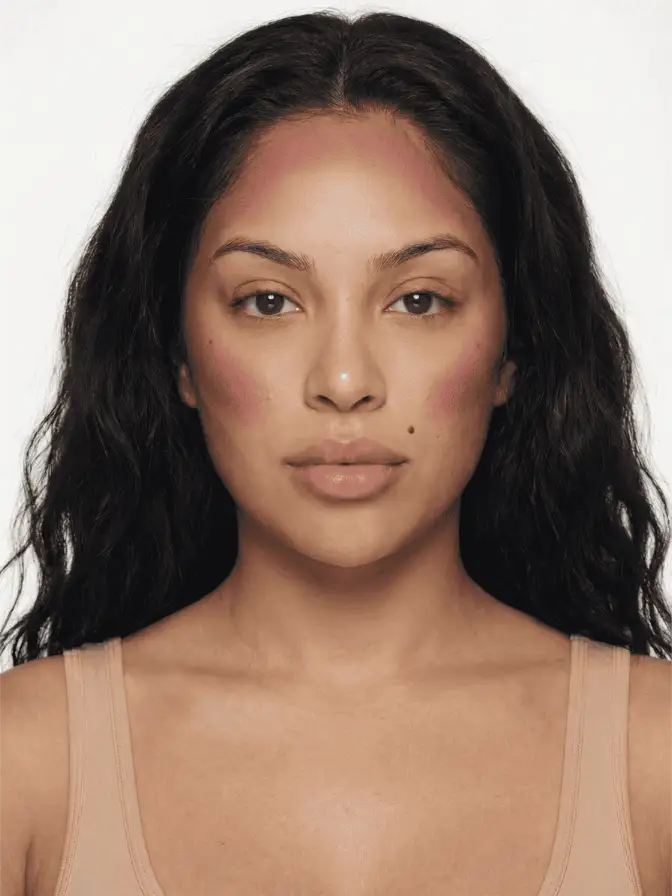
Blush draping is contour with pigment instead of shadow. The C-curve lifts every face shape, but the angle and pitch shift for round, oval, or long faces.
Blush draping was named in the 1970s by Way Bandy, the makeup artist who built Cher’s faces for most of the decade. Bandy was the first to put rouge anywhere other than the apple of the cheek; his clients walked the runway with blush sweeping from the cheekbone up into the hairline, a placement that read as blatantly sculptural under runway lighting. Forty-five years later, the same placement is back on TikTok being called a hack.
It is not a hack. It is a structural rule, and the structure is the C-curve.
The C-curve, defined
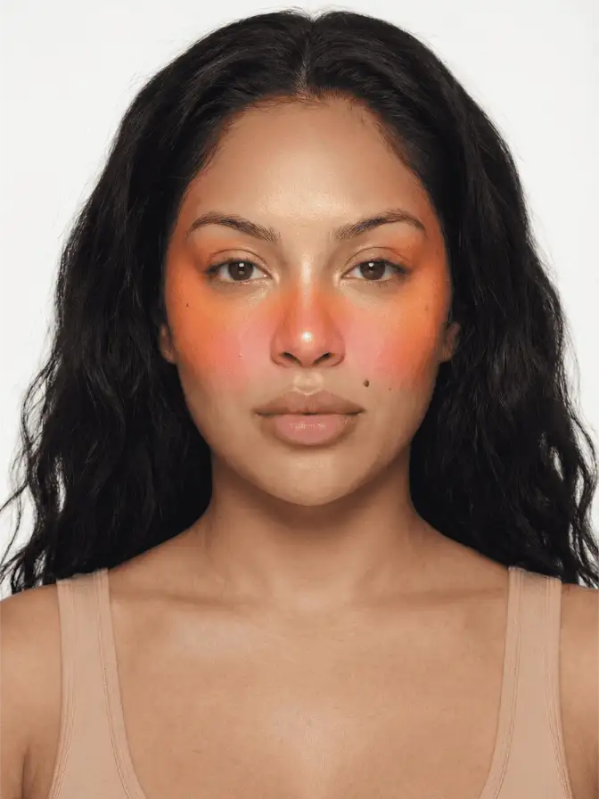
Place a finger on the highest point of your cheekbone, just below the outer corner of your eye. Now slide it up toward your temple, then forward into the hairline. That arc, traced in pigment, is the C-curve. NewBeauty’s coverage of the technique describes it identically: “starting at the highest point of the cheekbone, just under the outer corner of the eye, then sweeping the color up and out toward the temple in a C-shape, slightly onto the temple and hairline”.
The reason the curve works is the same reason traditional contour works. The eye reads warmth and shadow as depth cues. A diffuse warm patch high on the face pulls the eye upward, which makes the face read as lifted. A patch on the centre of the cheek does the opposite; it creates a focal point at the front of the face, which on round face shapes can amplify roundness rather than soften it.
Round face: pitch the curve high
A round face is widest at the middle and softest at the jaw. The drape needs to fight that horizontal emphasis, so you want the C steeper and higher than you would on other shapes.
Start the curve at the very top of the cheekbone, almost level with the outer corner of the eye, never below it. Angle the sweep up at roughly forty-five degrees toward the hairline behind the ear. The bareMinerals beauty desk recommends “placing blush just above the cheekbone and blending upward to create the illusion of sculpted contours” specifically for round shapes.
Avoid the apple of the cheek entirely on the first pass. If you want a flush on the front of the cheek, layer a tiny touch of cream blush there at the end, but the structural drape stays high.
The Patrick Ta blush placement guide lands on the same instruction with a colour-tone twist: deeper, slightly cooler shades work better here than peachy pinks, because the cooler temperature reads as natural shadow rather than added warmth. Rare Beauty Soft Pinch in Joy or NARS Liberte both sit in this register.
Oval face: traditional placement, light hand
An oval face is the textbook proportion every face-shape diagram is drawn to. The features are already balanced, so the drape can be classical: start at the cheekbone, lift it upward, do not overdo it. The risk on an oval face is making it look longer by pulling pigment too far up the temple.
The Laura Mercier guide to draping recommends a relatively short C, ending at the temple rather than continuing into the hairline. Use a slightly wider brush than you would on a round face, since the goal is not to sculpt but to wash colour across the existing structure.
If you are doing a more elaborate eye, like a striping draping variation that adds a coordinated wash on the eye, the cheek can be even more understated. The face only needs one focal point at a time.
Long or oblong face: bring the apple back in
A long face has more vertical distance than horizontal, so the standard C-curve, which adds vertical lift, is the wrong move. The fix, counterintuitively, is to put more product on the apple of the cheek and shorten the upward sweep.
bareMinerals’ face-shape guide recommends “longer face shapes often benefit from adding a touch of color to the apples for balance”. The placement breaks the vertical line of the face by pulling the eye horizontally across the centre rather than up toward the temple. Patrick Ta’s variation on this is to combine cheekbone draping with apple-of-the-cheek placement in a single sweep, which reads as a softer, less directional flush.
The boyfriend blush approach, where colour sits low and warm across the cheek-and-nose bridge area, also works for long faces because it widens the visual centre of the face rather than lengthening it.
Square or heart-shaped: balance the corners
Square faces have a strong jawline and a horizontal forehead. The drape here works as softening rather than lifting. Apply blush in gentle circular motions on the apples of the cheeks, then blend toward the temples to soften the lines, as bareMinerals’ guide recommends. Keep the curve more horizontal than diagonal.
Heart-shaped faces are wider at the forehead and narrow at the chin. The drape can balance the proportions by placing colour slightly lower on the cheekbone, pulling visual weight downward to compensate for the wider forehead. A monochromatic look that uses the same blush shade lightly on the forehead and cheeks unifies the face: the monochromatic tutorial on this site demonstrates the colour-coordination logic that makes this work without looking heavy.
Formula matters as much as placement
A C-curve drape covers more surface area than traditional blush, and powder alone tends to streak across that area unless your technique is excellent. Most makeup artists who specialise in draping work cream-first.
Westman Atelier Baby Cheeks Blush Stick, Tower 28 BeachPlease in cream finish, and Patrick Ta Major Headlines Double-Take in cream all blend to that satin, second-skin finish a drape needs. Apply with fingers, not a brush, for the first layer. The warmth of skin softens the edges. A flat foundation brush is useful only for blending out the boundary between drape and bare skin.
Powder, if you use it, layers on top of cream rather than replacing it. That is the draping sequence the slaye tutorial library teaches: cream as the structural layer, powder as the optional finish. Skipping the cream and going powder-only is the most common reason a drape ends up patchy.
When draping is the wrong call
Three contexts where draping is not the right choice:
A photo with hard front-on flash. Flash photography flattens the face, and the warm patch of a drape can read as a flushed splotch rather than a contour cue. For flash, classical apple-of-the-cheek placement reads better.
Daytime makeup with no eye product. A drape needs a small balancing element on the eye, even if it is just a wash of a coordinated cream shadow or a bit of mascara. Without it, the cheek can dominate and look unintentional.
Mature skin with significant volume loss in the cheek area. Putting colour high and angled can sit in the hollow rather than on the bone, which exaggerates rather than corrects. A more apple-forward placement reads better here. The sunset blush gradient placement, which moves from a deeper shade on the apple to a lighter peach near the eye, is a forgiving alternative.
The quick rule
Round face: high and steep. Oval face: classical, restrained. Long face: bring the apple back. Square: soften the corners. Heart: pull weight downward. Skin tone determines the colour temperature; face shape determines the angle.
Most botched draping comes from copying a tutorial drawn on someone whose face is shaped differently. The C-curve is the constant. The pitch of the curve is what changes.
Frequently asked
Where should I put blush if I have a round face?
Start the C-curve higher than the apple of the cheek and angle it more steeply toward the temple. Avoid putting any blush on the front of the cheek where it would emphasise roundness; the goal is to draw the eye up and out.
Does blush draping replace contour?
It can, for most daytime makeup. The C-curve uses warm pigment to do the same lifting work that bronzer or grey-brown contour does with shadow. Pairing them looks heavy unless you are doing red-carpet glam.
Cream or powder blush for draping?
Cream first, powder optional on top. Cream blush blends seamlessly across the larger area a drape covers, where powder alone tends to streak. Set with translucent powder if you have oily skin, or leave it cream-only for a satin finish.
Continue reading
- technique Stained Blush Without the Blotch: Applying Watercolor Cheek Tints Liquid and water-gel blush goes patchy because of speed and prep, not the formula. Here is the small-area, damp-finger method that fixes the blotch for good.
- technique Puppy eyeliner: the downturned wing for rounder eyes Puppy liner drops the flick instead of lifting it, the opposite of a cat eye. Why the downturned wing flatters hooded and downturned eyes, and how to draw it.
- technique Eyeshadow by Eye Color: The Complementary Rule, Used Well The color wheel says wear the opposite of your eye color. That is true and incomplete. Here is why complementary shadow works, and the nuance for each eye.