Inner-corner brightening: white pencil placement that opens the eye
A V of cream pigment at the tear duct re-spaces the eye more than mascara can. Placement rules, tone choices by undertone, and when the waterline backfires.
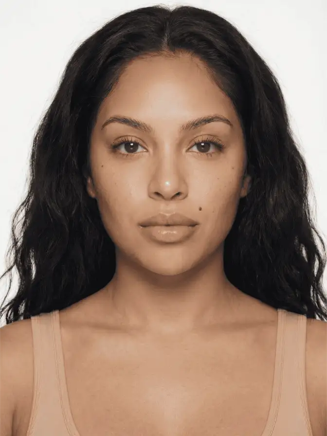
The tear duct is a fold of mucosa about four millimetres wide. Place a tiny V of light there, and most people will tell you that you’ve changed your eye shape. They’re not wrong. They’re describing a real geometric trick that has nothing to do with the pencil and everything to do with how the orbital bone catches ambient light.
The inner-corner highlight is the smallest move in the kit. It’s also the one I keep coming back to when a face needs to look more open without looking made up.
The geometry of the tear duct
When a face sits under flat overhead light, the orbital ridge above the eye casts a soft shadow downward, and the tear duct sits in the deepest pool of that shadow. The brain reads the shadow as a recess and the recess as a smaller, deeper-set eye.
A bright pigment at the duct breaks the shadow. The eye reads as wider at the inner third, which the brain interprets as more spacing between the eyes. That’s why an inner-corner brightener pulls features apart visually, and why it works on every eye shape, but does very different things on each one.
On a close-set eye, a champagne V pushes the inner edge of the eye toward the nose bridge and creates space where there wasn’t any. On a wide-set eye, the same move can overdo it and make the eyes look like they’re drifting outward, which is why models with wide-set placement get a softer pearl or a peach tone instead of stark white.
Laura Mercier’s Art of Living guide reduces the technique to a simple shape: “Fill the inner corner of your eye in a V shape and blend with a brush or ring finger onto the bridge of the nose.” That’s the move. The variable is the tone you fill it with.
Pencil, cream, or pressed shimmer
The format you use changes the finish more than the colour does.
A cream pencil like the Trish McEvoy Eye Brightener Pencil or the Tarte Fake Awake Highlight drags wax along with pigment, which gives a satin finish that catches light from one angle. It also stays put, because the wax binds to the lipid layer on the skin. Pencils are the move for eyes that water, oily lids, or anyone who lines their waterline.
A loose or pressed shimmer in the same V gives a sharper, more reflective bounce. Stila Magnificent Metals Glitter and Glow in Kitten Karma is famously sticky enough to anchor at the duct without falling onto the cheek. Pressed shimmer reads brighter than cream pencil under camera flash, which is why photo and runway artists default to it.
A liquid like Charlotte Tilbury Beautiful Skin Glow Lights is the editorial finish. It dries to a wet-look sheen that flatters skin in close-up photography but creases on most everyday wear once it hits the orbital fold. Save it for portraits, not for a workday.
For a doe eye, pencil works because the brightener is meant to read soft, not graphic. For a halo eye, pressed shimmer reads correctly because the whole look is built around a centre-lid focal point that needs a brighter terminal point at the duct. Format follows finish.
Tone is undertone math
The single most common mistake on an inner corner is a true white on warm-toned skin. White reflects cooler than the surrounding skin, which makes the duct look chalky and floats off the face.
A rough rule that holds up across most undertones:
- Cool undertones, fair to light: silver-pearl or icy pink reads correctly.
- Cool undertones, medium to deep: cooler champagne or soft mauve shimmer.
- Warm undertones, fair to light: warm champagne or soft peach.
- Warm undertones, medium to deep: gold, copper, or peachy bronze.
The L’Oréal Paris Beauty Magazine ingredient guide on white eyeliner makes the same point a different way: lighter shades like champagne, pearl, soft gold, and icy pink work best, with silvery tones for fair skin and gold or peachy tones for medium to deep skin. The reason that guidance keeps recirculating is that it’s true. The wrong tone reads as makeup. The right tone reads as a wide-awake morning.
When the waterline backfires
There’s a TikTok genre where someone scrubs a stark white pencil along the lower waterline and calls it the doe-eye hack. It works on the model in the video because the model has wide-set, large, slightly downturned eyes. The white expands the visible eye area without hitting the limits of the eye shape.
On a small or close-set eye, the same move shortens the apparent height of the eye and pushes everything inward. The waterline already reads cooler than skin in most lighting; flooding it with bright white pulls focus to a thin horizontal line instead of the eye itself.
The safer compromise on most eye shapes is a flesh-tone pencil (a warm beige or soft taupe) along the waterline, with the cooler white kept exclusively at the duct. The waterline reads brighter than the surrounding eye but doesn’t fight the shape. The duct stays as the only point of true reflection.
There’s also a practical issue: white eyeliner pigments tend to be loaded with titanium dioxide, which is the same opacifier in sunscreen. Titanium dioxide is fine on the lid but irritating to the mucosa in the waterline for sensitive eyes, especially anyone who wears contacts. Trish McEvoy’s pencil and the Stila version are both formulated specifically for the waterline. Many drugstore “white eyeliners” are not.
The order matters
Eyeshadow fallout dulls a fresh highlight. The inner-corner brightener goes on last, after liner and mascara, as the final move of the eye routine. If you place it earlier, every brush stroke afterward will deposit pigment dust on top of it and mute the reflection.
A neat workflow on a clean lid:
First, set the lid with a thin layer of cream concealer or a primer like NARS Pro-Prime Smudge Proof. Sweep your shadow shapes and blend the transition.
Then liner. If you’re doing a soft airbrush finish or a no-makeup-makeup base, liner is optional and a smudgy brown sits in the lash line only.
Then mascara, top lashes first, bottoms only if you want the look more graphic.
Last, the brightener. Two dabs at the duct with the pencil tip, a small V shape, and a fingerprint of pressure to blend the outer edge into the inner lid. Don’t blend the duct edge itself: that’s the point of reflection. You want it sharp on one side and feathered on the other.
The whole move takes maybe four seconds. That’s the part that gets undersold. A four-second adjustment changes apparent eye spacing more than two minutes of cut crease ever will.
Frequently asked
Does white eyeliner on the waterline make your eyes look bigger?
Sometimes. On a wide-set or large eye, a stark white waterline reads as bright and lifted. On a close-set or small eye, that same white can blow out the natural rim and make the eye look smaller, not larger. The safer move on most eye shapes is a warm flesh-tone pencil on the waterline and a cooler white kept to the tear duct only.
What's the difference between a champagne and a true-white inner corner?
Champagne reflects warm light, so it sits on skin without looking pasted on. True white reflects cooler light and reads more graphic. For everyday wear, champagne or soft gold blends with skin. For editorial or stage, true white or icy pearl pops harder under camera flash.
Should you brighten the inner corner before or after eyeshadow?
After. Eyeshadow fallout will dull a fresh inner-corner highlight if you apply it first. Set the lid, sweep your shadow, do liner and mascara, and then place the inner-corner pigment last. It's the final move, the one that wakes the whole eye up.
Continue reading
- technique Stained Blush Without the Blotch: Applying Watercolor Cheek Tints Liquid and water-gel blush goes patchy because of speed and prep, not the formula. Here is the small-area, damp-finger method that fixes the blotch for good.
- technique Puppy eyeliner: the downturned wing for rounder eyes Puppy liner drops the flick instead of lifting it, the opposite of a cat eye. Why the downturned wing flatters hooded and downturned eyes, and how to draw it.
- technique Eyeshadow by Eye Color: The Complementary Rule, Used Well The color wheel says wear the opposite of your eye color. That is true and incomplete. Here is why complementary shadow works, and the nuance for each eye.