Cherub Blush: The Bridge-of-the-Nose Placement Returns
Blush across the bridge of the nose returned at SS26 via Renaissance reference. Where to put it, where to stop, and what reads chic versus wind-burnt.
The April 2026 cover of Vogue Italia put Liu Wen on a backdrop of yellow ochre with blush running from cheekbone to cheekbone across the bridge of her nose. The placement was not subtle. The makeup artist, Lucia Pieroni in her interview with the magazine, called it “Bronzino’s daughters”, a reference to the sixteenth century Florentine portraitist whose subjects all carry that same diffused warmth across the upper face.
Six weeks later it was everywhere. Marie Claire’s summer trend roundup called it “cherub cheeks” and credited the SS26 runways with bringing the placement back into circulation. The bigger story is that bridge-of-the-nose blush isn’t new at all. It’s the cheekbone placement of the late 2010s that was the historical anomaly.
Why the placement actually works
Blush is a geometry tool before it’s a color tool.
When you place blush on the apple of the cheek, you draw attention down and to the sides, accentuating roundness. When you place it on the upper cheekbone, you draw attention up and out, sharpening the bone. When you carry it across the bridge of the nose, you do something different. You shorten the apparent length of the midface and unify the upper face into a single warm field.
That unification is what reads as youthful, which is what “cherub” is doing as a code word. Renaissance painters used this technique on putti and on women they wanted to depict as girlish. The bridge-of-nose flush flattens the gap between the eyes and pulls the whole upper face forward, which is what babies’ faces look like before bone structure asserts itself.
Runway Magazine noted the SS26 shift was specifically about “rounded placement, creamy textures, and rosy hues that recall Renaissance portraits”. The texture cue matters as much as the placement.
Where to start the line, where to stop
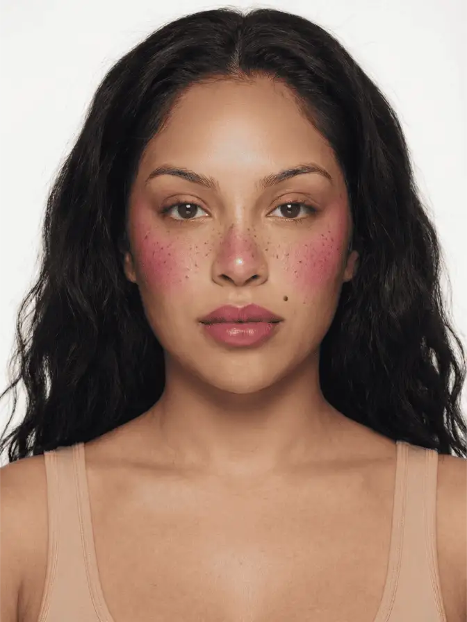
The placement that flatters most face shapes runs from the upper apple of one cheek, across the bridge of the nose, to the upper apple of the other cheek. Imagine a slightly downward-curving arc that follows where windburn would actually land.
Three landmarks to honor:
-
Outer start point. Begin one fingertip’s width below the outer corner of the eye, at the top of the cheekbone where it meets the temple. Anywhere lower than that and the placement reads adolescent, not classical. Anywhere higher and you’ve made a stripe across the temple, which is a different look (and not a flattering one outside of a fashion show).
-
Bridge crossing. The blush crosses the nose at the saddle, the slight indentation between the eyes where glasses rest. Not lower. The lower bridge has more cartilage and reflects light differently; pigment placed there can fight the natural shadow of the nose.
-
Stop point on the nose itself. The color fades, never solid, as it crosses the bridge. By the time you reach the tip of the nose there should be no pigment at all. A solid line of blush from cheek to cheek is the version of this trend that reads “clown” rather than “putto”.
Lay your foundation first, fully. Then apply cream blush. The chronology matters because cream blush on top of bare skin pulls the warmth differently than cream blush on top of base; the latter is what you want for the diffused-fresco effect.
Product specifics that work
Cream is non-negotiable for this placement, at least for the first layer. Three formulas that have given me clean results in studio shoots over the past month:
Westman Atelier Baby Cheeks in Petal: a soft pink-coral that flatters Northern European skin tones and reads neutral on most mid-tones. The formula stays tacky just long enough to blend, then sets.
Glossier Cloud Paint in Beam: cheaper, available, and the brick-warm tone reads more “Bronzino” than the older blue-pink Cloud Paint shades. Apply with a damp finger.
NARS Air Matte Blush in Rush: the dot dispenser is forgiving for nose-bridge work because you can place a single dot at the bridge crossing without overcommitting. The matte finish gives you the fresco effect more honestly than a dewy formula.
For darker complexions, Pat McGrath Divine Blush in Vivid Decadence reads as actual flush, not chalk; and the Danessa Myricks Yummy Skin Blurring Balm Powder in Soft Red sets without a tide-line on warm-deep skin.
If you want to study the placement on people who’ve done it well, the strawberry girl tutorial base is closest, with the modification that the diffuse zone extends across the nose rather than stopping at the inner corner of the eye. The igari technique is the Japanese antecedent, used since at least the early 2010s in editorial work in Tokyo. Both are useful reference points.
What to avoid
This is the placement where overdone reads instantly. A few specific traps.
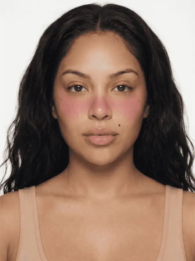
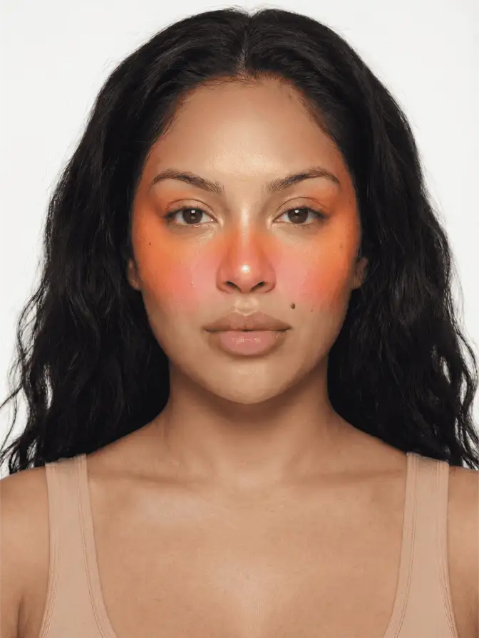
Solid pigment across the nose. The bridge color must be 30 to 40 percent of the cheekbone intensity at most. If you can see a clean line of blush on the nose, you’ve done it wrong.
Pink that doesn’t match your undertone. Renaissance painters used red lake and madder; both pull warm. A blue-pink cream blush on the nose bridge looks like a chill, not a flush. Lean warm: brick, terracotta, peach-red, true rose. Save the pinks for boyfriend blush placement at the apples only.
Highlighter on top. The Renaissance reference is about diffused warmth, not shine. Skip the highlight on the nose bridge entirely. If you want any luminosity, place it on the high cheekbone outside the blush zone.
Powder bronzer first, then blush. The bronzer compresses the nose, the blush widens it, and the two cancel. If you want any contour, place it under the cheekbone where the blush hasn’t traveled, not on the sides of the nose.
The face this complements
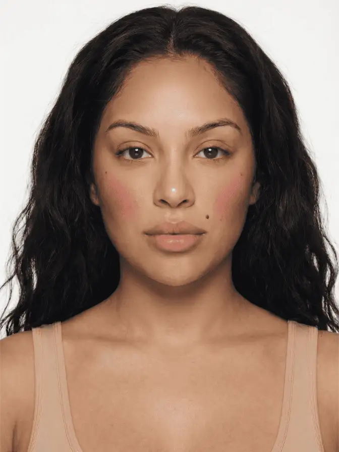
Bridge-of-nose blush wants company that’s quiet. The look fights with strong eyeliner; it pairs with a soft kohl wash or nothing at all on the eye. Lips can go either way: a sheer wash of the same warm tone for full Bronzino, or a flat brown nude if you want the flush to be the only event.
For a daytime version of this, try the sunset blush gradient with the warmest color extended across the bridge rather than stopping at the cheekbone. For a polished evening version, layer a sheer powder of the same family on top, focused at the apples only, and let the bridge crossing stay slightly fainter.
The placement isn’t going anywhere this season. By autumn, expect to see it normalized to the point of becoming the default rather than a trend, and then expect a backlash, and then expect it to settle in as one of the three or four blush placements that fashion-aware faces rotate between. The cheekbone-only era was the historical aberration, and we’re correcting back toward the older, more pictorial map of the face.
Frequently asked
Where exactly do you stop the blush on the nose bridge?
Stop before the tip. The pigment should fade roughly two-thirds of the way down the bridge, never crossing the lower nasal cartilage. The exact stop point is where you stop being able to feel bone under your finger; beyond that, the nose flares and the color reads clownish.
Does cherub blush work on darker complexions, or does it read ashy?
It works on every depth but the pigment choice shifts. Mid-tones flatter at warm berry and brick; deep complexions read best with red-violet or true crimson. Stay away from pink-pink. The cool pastels meant for Renaissance reference were painted onto pale skin, and the chemistry doesn't translate.
Cream or powder for nose-bridge blush placement?
Cream first. The nose has more sebum than the cheekbone and a powder placed there in the morning will slide into a tide-line by lunch. A sheer cream layer pressed in with fingers, optionally set with a whisper of the same shade in powder, gives the most durable wear and the most realistic flush.
Continue reading
- technique Stained Blush Without the Blotch: Applying Watercolor Cheek Tints Liquid and water-gel blush goes patchy because of speed and prep, not the formula. Here is the small-area, damp-finger method that fixes the blotch for good.
- technique Puppy eyeliner: the downturned wing for rounder eyes Puppy liner drops the flick instead of lifting it, the opposite of a cat eye. Why the downturned wing flatters hooded and downturned eyes, and how to draw it.
- technique Eyeshadow by Eye Color: The Complementary Rule, Used Well The color wheel says wear the opposite of your eye color. That is true and incomplete. Here is why complementary shadow works, and the nuance for each eye.