Eyeshadow by Eye Color: The Complementary Rule, Used Well
The color wheel says wear the opposite of your eye color. That is true and incomplete. Here is why complementary shadow works, and the nuance for each eye.
There is one piece of eyeshadow advice that gets repeated everywhere, usually with a little color wheel graphic attached: wear the opposite of your eye color. Ulta’s eyeshadow color wheel guide frames it cleanly, find your iris on the wheel and choose a shade from the far side, and it is genuinely good advice. It is also where most articles stop, which is a shame, because the rule has a reason behind it and a few catches that decide whether it flatters you or fights you.
Why opposites work at all
The mechanism is a perceptual quirk called simultaneous contrast. When two complementary colors sit next to each other, each one makes the other look more saturated and more vivid than it would alone. Put copper next to a blue iris and the blue reads bluer. Put plum beside a green iris and the green deepens. Your eye is not changing color. The shadow is rigging the comparison so the iris wins.
That is the whole engine. The color wheel trick is really a contrast trick, and once you think of it that way, the nuance starts to make sense. Contrast is powerful, but it is not always what you want, and it is not the only variable in play.
The four eye colors, with the part the listicles skip
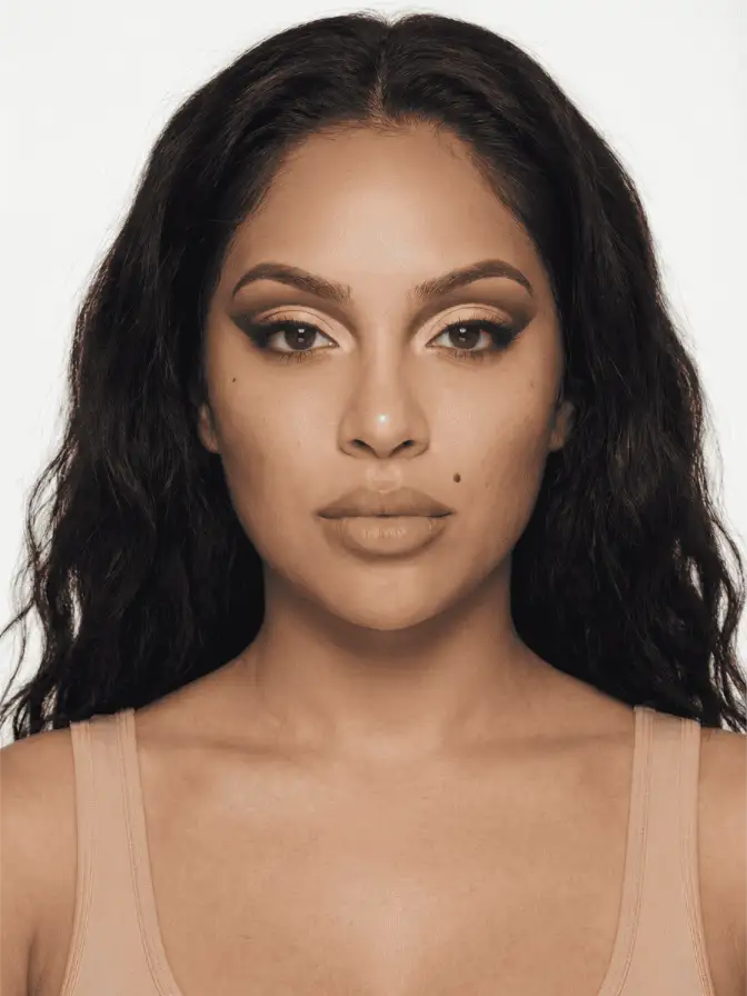
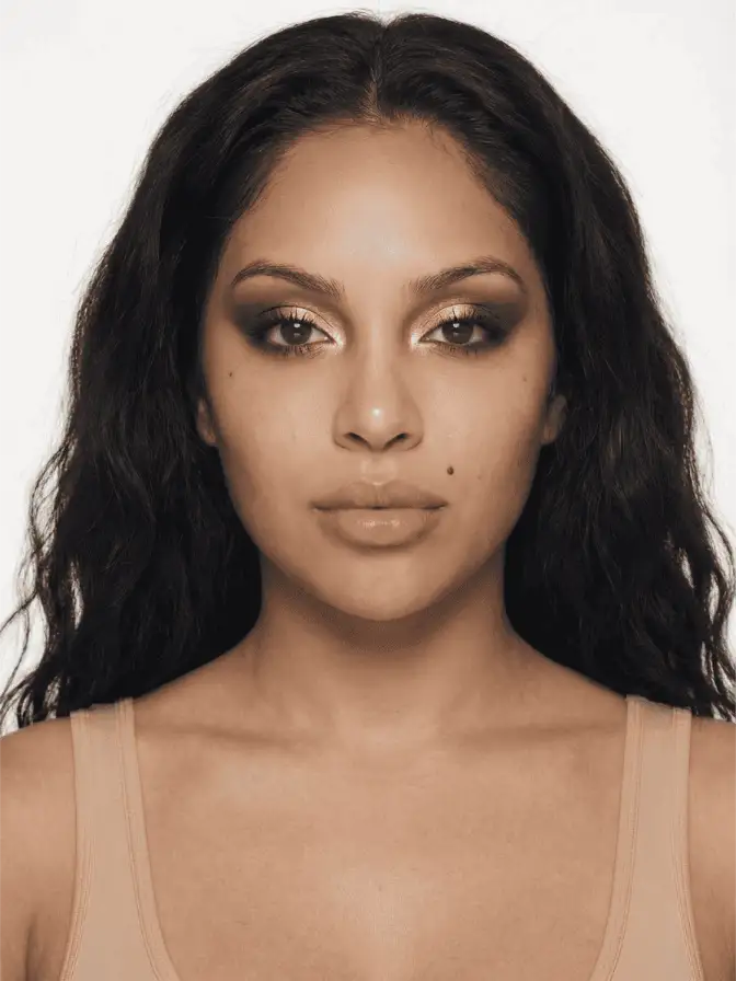
Blue eyes. Blue sits opposite orange, so the flattering family is everything in that warm band: caramel, copper, gold, peach, soft brown. e.l.f.’s color guide points straight at coppers and warm browns for blue eyes, and they work because the warmth throws the cool iris into relief. The catch is value. A pale, icy blue eye can get overpowered by a heavy, dark copper, so keep the intensity in proportion to how light your eyes are. Pale eyes, lighter hand.
Brown eyes. Brown is the cheat code, because it is a neutral and has no single opposite to obey. That freedom is real, but it can read as “anything goes,” which is not quite true. The shades that make brown eyes genuinely pop are the saturated jewel tones: emerald, cobalt, deep purple, magenta. Warm bronzes and coppers look beautiful on brown eyes too, but understand the difference, the bronze harmonizes and the emerald contrasts. If you want the iris to look richer rather than just want a pretty wash, reach for the jewel tone.
Green eyes. Purple is green’s complement, so plum, eggplant, mauve, and burgundy are the high-contrast picks, and they are reliably stunning. The nuance Clinique and others hint at is that “purple” covers a lot of ground. A soft mauve is everyday wearable. A true violet is a statement. Match the boldness of the purple to the occasion rather than assuming all purples behave the same.
Hazel eyes. Hazel is the interesting one because it is not a single color, it is brown and green negotiating, often with the balance shifting by the day and the light. That gives you a choice, which Clinique’s hazel guide leans into. Cool shades like eggplant, mahogany, and plum pull the green forward and make the eye read greener. Warm rose golds and honeyed tones do the opposite and bring out the brown. You are not stuck with one answer; you are deciding which half of your iris to amplify.
The two things the rule forgets
First, hue is only one dimension of color. Value, meaning how light or dark a shade is, and saturation, how intense it is, matter just as much. A complementary shadow that matches your iris in value will not create much contrast, because contrast needs a difference to work with. This is why a medium-brown shadow can look flat on medium-brown eyes even though brown is “safe.” If the rule seems to be failing you, it is usually a value problem, not a hue problem. Go lighter or darker than your iris, not just opposite to it.
Second, complementary is the maximum-contrast option, not the only good one. Sometimes you want harmony instead. A monochrome eye, a warm bronze on a brown eye, a soft taupe on anyone, none of these obey the opposite rule and all of them can look gorgeous. The complement rule is a tool for making eyes stand out. On a day you want a quiet, polished face rather than a striking one, ignore it on purpose.
Where you put it matters as much as which you pick
A complementary shade does the most work when it sits where the eye is most visible and closest to the iris. Concentrating your contrast color on the lid and the lower lash line, right up against the iris, gets you far more payoff than burying it in the crease. The placement of a halo eye, with the brightest shade pooled in the center of the lid, is practically built for this, because it puts your most reflective contrast color directly in front of the iris.
You can also let just one feature carry the color. Run your complementary shade only along the lower lash line, leave the lid neutral, and you get the iris-brightening effect without a full color commitment. For more structure, the controlled bands of a cut crease let you place a contrast shade with real precision, while a softer, blended smoky eye can be built in your complement instead of the default black or brown for a version that flatters the iris rather than just darkening the eye. And if you would rather keep things gentle, a soft glam base with a single well-chosen contrast shade on the lid is usually all the color theory a face needs.
Skin tone and undertone get a vote too
The iris is not the only color near your shadow. Your skin tone and undertone sit right there in the frame, and a complement that flatters the eye can still clash with the face if you ignore them.
The practical version is about warmth. A warm complement, copper for blue eyes or a rose gold for hazel, tends to sit easily on warm-undertoned skin and can look slightly muddy on very cool complexions. A cool complement, a true plum for green eyes or an icy jewel tone for brown, does the reverse. None of this overrides the eye-color rule; it just nudges which member of the flattering family you reach for. Two people with the same blue eyes might want a peachy copper and a deeper bronze respectively, and both are obeying the same rule.
Hair color quietly factors in as well. The contrast between shadow and brows reads as part of the look, so a very dark brow can carry a bolder complement than a pale one. If your result looks slightly off and the hue is right, check whether the issue is actually the warmth or the intensity rubbing against your skin rather than your eyes.
The rule is sound. Wear the opposite of your eye color and the contrast will make your iris look more vivid. Just remember what it is actually doing, manage the value as carefully as the hue, and treat “complementary” as the loud option you reach for when you want eyes to be the headline, not as a law you owe your face every morning.
Frequently asked
What eyeshadow color makes brown eyes pop?
Brown is a neutral, so it has the most freedom. Jewel tones do the heavy lifting: emerald, cobalt, deep purple, and magenta all make brown irises read richer. Warm coppers and bronzes flatter without contrast, while cool jewel shades create it.
Do purple eyeshadows really suit green eyes?
Yes, because purple sits opposite green on the color wheel, so it maximizes contrast and makes the green look more saturated. Plum, eggplant, and mauve are the most wearable versions. A true grape can be striking but reads more editorial.
What is the complementary color rule for eyeshadow?
Find your eye color on the color wheel and pick a shade from the opposite side. Opposites intensify each other through simultaneous contrast, so the eyeshadow makes your iris look more vivid. Drifting one or two steps off the exact opposite keeps it wearable.
Continue reading
- technique Stained Blush Without the Blotch: Applying Watercolor Cheek Tints Liquid and water-gel blush goes patchy because of speed and prep, not the formula. Here is the small-area, damp-finger method that fixes the blotch for good.
- technique Puppy eyeliner: the downturned wing for rounder eyes Puppy liner drops the flick instead of lifting it, the opposite of a cat eye. Why the downturned wing flatters hooded and downturned eyes, and how to draw it.
- technique Monolid Eyeshadow: The Place-It-Higher Rule On a monolid, shadow set in the anatomical crease vanishes when the eye opens. Here is why placement moves up, and how to build a crease instead of chasing one.