Checkerboard Lips: Reading the Proenza Schouler Graphic Red
Proenza Schouler's SS26 runway sent down a graphic red lip built from alternating matte and satin squares. Here's what it actually means and how to wear it.
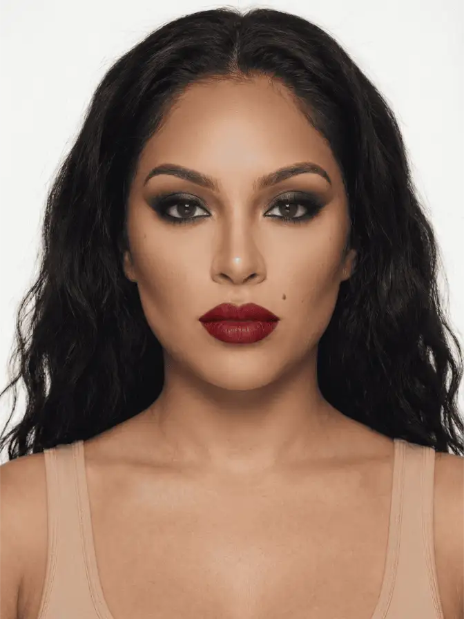
The model walked out at 11:08 on a September Friday in Tribeca with her mouth divided into four squares of red. Two matte, two satin, edges sharp enough to read from the back of the room. Backstage at Proenza Schouler’s Spring 2026 show, the lead artist had used a small flat brush and what looked like a transparent stencil to lay down alternating finishes of what was clearly the same red.
It was the moment of the season that nobody could let go of.
Most runway makeup is a directional whisper. A subtle wash of color, a placement choice, something the press release can describe with the word “fresh”. The checkerboard lip wasn’t that. It was a declaration that lipstick can be drawn on, not just worn, and that the surface of the mouth is a medium.
What the technique actually is
Strip away the staging and the look is mechanical. A flat matte red goes on first as the base layer across the whole lip. Then a small flat brush, the kind sold for lip-lining or fine concealer work, lifts a clear gloss or a satin-finish topper and places it inside marked-off squares. The result is one color, two textures, hard edges between them.
Some artists at the show used a thin tape mask to keep the grid clean. Others freehanded with a steady wrist. The grid wasn’t perfectly equal in every model; in close-up backstage shots from SHOWstudio’s archive, you can see the squares shift in proportion depending on lip shape. A wider lower lip gets bigger lower squares. A flat cupid’s bow gets a smaller top row.
The light reads it as embossing. From the front row, the satin squares catch the highlight and pop forward; the matte squares recede. The lip looks dimensional in a way no single-finish lipstick can produce.
Why now
Runway Magazine’s beauty desk called the checkerboard lip “the most talked-about runway moment” of SS26, which it was, but the bigger story is the company it kept on the schedule. The same season delivered watercolor washes from Erdem, smudged kohl waterlines from Loewe, and bronze-on-bronze eyes at Tory Burch. Across designers, makeup was doing something it hasn’t done in a while: showing the brushwork.
For most of the 2010s and into the early 2020s, the visible-artistry mode of makeup was suppressed. Everything was meant to look skin-like, blurred, soft-focus. Who What Wear’s SS26 roundup flagged this season as the inflection: a deliberate return to makeup that announces itself as paint.
The checkerboard is the cleanest example of that shift. It cannot be confused for “natural”. It cannot be confused for a lipstick swiped on. Someone, with tools, made this happen on this face.
The wearable version, honestly
Almost no one is going to wear four red squares to dinner. That’s fine. The trend matters because of what filters down, and the filter happens fast.
Three softer versions you’ll start seeing on TikTok within the next six weeks:
-
One satin square, three matte. A single glossy bullseye dead-center on the lower lip, rest of the mouth in flat red. Reads from across a room as a strange catch of light, up close as deliberate. Pair with a clean, unlined eye, the kind you’d build with the doe eye tutorial as a base. The lip is the only event on the face.
-
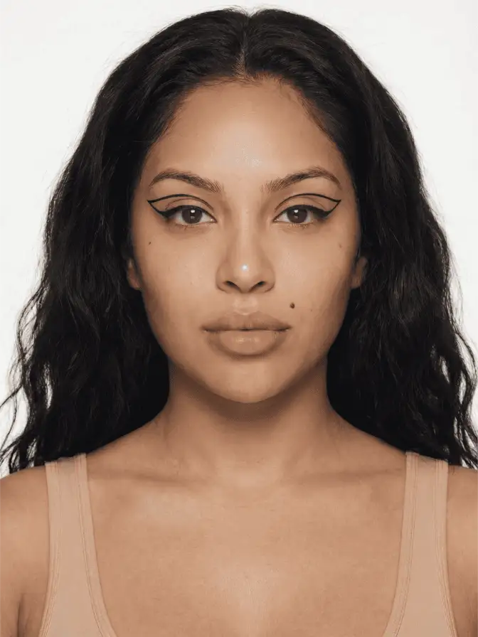
Matte border, satin center. Outline the lip with a matte pencil in the same shade as your lipstick, leave a 2mm margin inside that border bare, then fill the center with a satin or sheer formula. From a phone camera, this reads as a graphic lip without explaining itself. Less commitment.
-
Two-finish ombré. Matte at the corners, satin in the middle third. Skips the grid entirely but borrows the principle. Good for anyone whose lip shape doesn’t want hard internal lines.
A note on red selection. The Proenza red was warm, slightly orange-leaning, the kind of red that flatters most skin tones without going either cool-blue or tomato. If you’re shopping the look, Pat McGrath’s MatteTrance in Elson and LuxeTrance in a matching tone are the closest off-the-rack pairing. NARS Audacious in Rita gives a comparable warm red in matte. Tom Ford Lip Color Satin Matte in Scarlet Rouge is the satin half if you mix brands.
Pairing it with the rest of the face
The checkerboard is loud. Everything else needs to whisper.
Skin should look like skin. Not glass-skin, not blurred, not cloud-finished, just skin with its actual texture visible. A sheer base like Hourglass Vanish Airbrush, a touch of cream blush where flush would naturally land, no powder unless you’re standing under photo flash.
Eyes go bare or close to it. A coat of brown mascara, maybe a single soft line at the upper lash root, nothing competitive. If you want a reference look, this is the kind of eye that anchors a classic red carpet black-tie face but pulled down two notches. A clean inner-corner highlight does a lot of work here without competing with the mouth.
Brows: groomed but not drawn. Hairs visible. The brow should look uncomposed because the lip is doing all the composing.
Why the grid matters and not the color
Plenty of designers have sent red lips down the runway. The checkerboard’s interest isn’t the red, which is conventional. It’s the surface.
When Marie Claire’s beauty team catalogued the season’s defining gestures, they kept returning to texture: pearlescent skin, smoldering bronze eyes, “mermaid” wet-look highlights. The unifying thread is that makeup is being asked to behave like a material, not a tint. Velvet versus chrome versus jelly versus matte. The checkerboard takes that argument to its most legible form. Same color, two materials, in the same place.
There’s something almost architectural about it. The Proenza show notes referenced material study in the clothing. The lip was a continuation. Beauty as construction, not as flush.
Where this goes next
A few predictions worth holding loosely.
Beauty brands will release “split-finish” lip duos. Pat McGrath probably first, given her runway proximity. Expect to see at least one drugstore brand do a budget version by autumn with a single tube and a built-in flat brush.
The grid itself will move. By July you’ll see a version on the cheek, alternating cream and powder squares in a blush placement experiment. The technique is portable and TikTok will port it.
It will also collide with the negative-space liner crowd, who already think of the face as a flat plane to compose. Someone will do a full grid of matte and satin nude across the entire mouth and the comments will be split fifty-fifty between “iconic” and “stop”.
What won’t happen: people wearing this on Tuesday for the office. That’s not the point of a runway lip. The point is that it shifts what feels possible, and a less aggressive version of “shifts what feels possible” is what you’ll see on the people around you within the season.
If you try it, please use the same red in two finishes, not two different reds. The whole effect collapses if the colors don’t match.
Frequently asked
Can you actually wear checkerboard lips out, or is it strictly runway?
A miniature version reads as intentional texture rather than performance: one satin square dead-center on the lower lip and the rest of the mouth in a flat true red. Save the full four-square version for editorial photography or events where lighting is on your side.
What lipsticks work best for the matte and satin contrast?
You want the same red pigment in two finishes so the squares don't fight on tone. Pat McGrath's MatteTrance in Elson and her LuxeTrance in a matching red work well; so does the Charlotte Tilbury Matte Revolution / K.I.S.S.I.N.G. duo if the shade names align in a given season.
Why does this trend feel different from past graphic-lip moments?
Past graphic lips used color contrast: black liner inside a red lip, or ombre fading to gloss. Proenza's version uses finish contrast on a single uniform color, which is harder to do and reads as material study rather than novelty.
Continue reading
- trends The Gray Grunge Eye: The Soft Rock-Star Smudge of Summer Black smoke went hard and dated. The gray grunge eye on this summer's runways is smudged, dewy, and cool. Here is why it works and how to wear it.
- trends Butter Yellow Eyeshadow, the Soft Neutral That Isn't Butter yellow ran the runways, then landed in TikTok makeup tutorials. It acts like a warm neutral but reads as color. Here is how to wear it by skin tone.
- trends Sunburn Blush: The Flush That Crosses the Nose The summer 2026 blush trend drags warm color across the nose and upper cheeks to fake a sun-touched flush. Here is where to place it and what holds in heat.